Quantifying performance notebook
Authors: Enze Chen and Mark Asta (University of California, Berkeley)
Note
This is an interactive exercise, so you will want to click the and open the notebook in DataHub (or Colab for non-UCB students).
Learning objectives
This notebook contains a series of exercises that will teach you ways we evaluate ML model performance in the train-validate-test paradigm. We will rely heavily on modules in the scikit-learn package to implement these concepts. By the end of this lesson, you will be able to:
Use error metrics and visualizations to assess model performance and evaluate the appropriateness of these methods in regression settings.
Articulate the importance of having training, validation, and test datasets.
Implement these ideas, including cross-validation, using scikit-learn.
We will progress through most of this exercise together as a group and are happy to take questions you might have.
Contents
These exercises are grouped into the following sections:
Classification model performance (bonus)
Import Python packages
Please remember to run the following cell before continuing!
import numpy as np
import pandas as pd
import matplotlib.pyplot as plt
%matplotlib inline

from sklearn.linear_model import LinearRegression

plt.rcParams.update({'figure.figsize':(8,6),       # Increase figure size
                     'font.size':20,               # Increase font size
                     'mathtext.fontset':'cm',      # Change math font to Computer Modern
                     'mathtext.rm':'serif',        # Documentation recommended follow-up
                     'lines.linewidth':5,          # Thicker plot lines
                     'lines.markersize':12,        # Larger plot points
                     'axes.linewidth':2,           # Thicker axes lines (but not too thick)
                     'xtick.major.size':8,         # Make the x-ticks longer (our plot is larger!)
                     'xtick.major.width':2,        # Make the x-ticks wider
                     'ytick.major.size':8,         # Ditto for y-ticks
                     'ytick.major.width':2,        # Ditto for y-ticks
                     'xtick.direction':'in',
                     'ytick.direction':'in'})
Regression model performance
Like the previous lesson, we’ll talk about regression and classification problems separately, as they will have different performance metrics. Also like in the previous lesson, we’ll spend quite some time sketching and discussing these concepts live using an iPad, so we’ll only offer a quick summary here and use the notebook mostly for live demonstrations and hands-on practice.
Error metrics: RMSE and MAE
In the last notebook, we used the squared loss for the cost function, and we can do something similar to get the root-mean-square error (RMSE). The mathematical expression for the RMSE between the target vector \(\vec{y}\) and the predicted values \(\hat{y}\) is:
Another popular error metric is the mean absolute error (MAE), which is given by
The minimum values for both of these metrics is 0, and the closer we get to this the better our predictions.
Pause and reflect: What are the differences between these two metrics?
Scikit-learn performance metrics
Scikit-learn has RMSE and MAE (and many other) regression performance metrics accessible through the sklearn.metrics module.
The RMSE can be computed using the mean_squared_error(y_true, y_pred, squared=False) method by passing the additional parameter squared=False.
The MAE can be computed using the mean_absolute_error(y_true, y_pred) method.
from sklearn.metrics import mean_squared_error, mean_absolute_error   # syntax for multiple imports from same module

# simple arrays for demonstration; you can verify results by hand!
a = np.array([10, 1])
b = np.array([0, 0])

print(f'The RMSE is {mean_squared_error(a, b, squared=False)}.')
print(f'The MAE is {mean_absolute_error(a, b)}.')
The RMSE is 7.106335201775948.
The MAE is 5.5.
Exercise: compute both error metrics for linear regression for the atomic mass prediction problem
Note that unlike the previous notebook, we’re giving you a lot more features (and many more elements) to work with, so have fun! You can start with just using the atomic number to predict atomic mass, and then see what other features you want to add to your design matrix to lower the error.
Hints:
When selecting columns of pandas DataFrames to construct \(X\), even for a single column, format your selection as a list. By which we mean:
X = df[['atomic_number', 'row']]   # this is good; a list of 2 column names
X = df[['atomic_number']]          # this is good; a list of 1 column name
X = df['atomic_number']            # avoid this!!! a string of 1 column name
Note that before fitting the data, we also scaled the input features to zero mean and unit variance using the StandardScaler. This is a best practice for linear regression and other algorithms optimized by gradient descent. Why might we want to do this?
Using the original list of 50 elements (if you truncate the following) and
atomic_numberas a single feature, your RMSE/MAE will be around 1.72/1.34. Using the full list of 100 elements (what’s loaded in) andatomic_numberas a single feature, your RMSE/MAE will be around 3.54/2.88.
df = pd.read_csv('../../assets/data/week_1/04/elem_props.csv')
display(df.head())
X = df[['atomic_number']]
y = df['atomic_mass']

from sklearn.preprocessing import StandardScaler
scaler = StandardScaler()
X_scaled = scaler.fit_transform(X)
# -------------   WRITE YOUR CODE IN THE SPACE BELOW   ---------- #

# --------------------------------------------------------------- #
fig, ax = plt.subplots()
ax.scatter(X, y, label='data')
ax.plot(X, lr.coef_[0] * X_scaled + lr.intercept_, 'gray', label='regression')
ax.set_xlabel('atomic number')
ax.set_ylabel('atomic weight')
ax.legend()
plt.show()
| symbol | name | atomic_number | atomic_mass | atomic_radius | row | group | is_metal | electronegativity | density_solid | melting_point | molar_volume | refractive_index | elec_resist | therm_cond | youngs_mod | poissons_ratio | |
|---|---|---|---|---|---|---|---|---|---|---|---|---|---|---|---|---|---|
| 0 | H | Hydrogen | 1 | 1.007940 | 0.25 | 1 | 1 | False | 2.20 | NaN | 14.01 K | 11.42 | 1.000132 (gas; liquid 1.12)(no units) | NaN | 0.1805 | NaN | NaN |
| 1 | He | Helium | 2 | 4.002602 | NaN | 1 | 18 | False | NaN | NaN | 0.95 K | 21.00 | 1.000035 (gas; liquid 1.028)(no units) | NaN | 0.1513 | NaN | NaN |
| 2 | Li | Lithium | 3 | 6.941000 | 1.45 | 2 | 1 | True | 0.98 | 535.0 | 453.69 K | 13.02 | NaN | 9.500000e-08 | 85.0000 | 4.9 | NaN |
| 3 | Be | Beryllium | 4 | 9.012182 | 1.05 | 2 | 2 | True | 1.57 | 1848.0 | 1560.0 K | 4.85 | NaN | 3.800000e-08 | 190.0000 | 287.0 | 0.032 |
| 4 | B | Boron | 5 | 10.811000 | 0.85 | 2 | 13 | False | 2.04 | 2460.0 | 2349.0 K | 4.39 | NaN | 1.000000e+12 | 27.0000 | NaN | NaN |
---------------------------------------------------------------------------
NameError                                 Traceback (most recent call last)
<ipython-input-3-1d6b89426cfe> in <module>
     12 fig, ax = plt.subplots()
     13 ax.scatter(X, y, label='data')
---> 14 ax.plot(X, lr.coef_[0] * X_scaled + lr.intercept_, 'gray', label='regression')
     15 ax.set_xlabel('atomic number')
     16 ax.set_ylabel('atomic weight')

NameError: name 'lr' is not defined
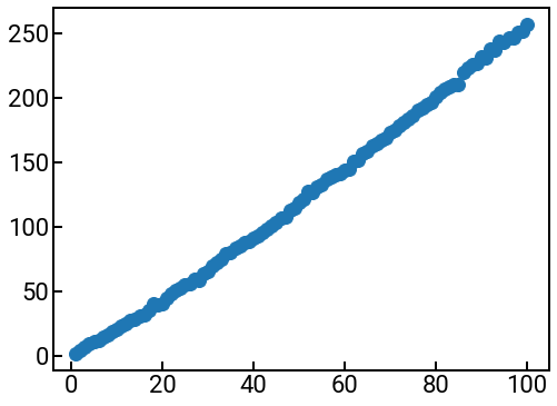
Visualizations: parity plots
Note that previously when we visualized our regression results, we showed output vs. inputs (a single feature), where the scattered points are \(y\) (truth) vs. \(x\) and the regression line was \(\hat{y}\) (prediction) vs. \(x\). The regression line is really made of 100 predictions from our model, and these predicted points are connected by a line, forming the line of best fit.
Another way to visualize the results, particularly when there are many input features, is with a parity plot or predicted vs. actual plot. As the second name implies, this plot shows a scatter plot of the predicted target values (from the model) on the \(y\)-axis and the actual target values (from the original dataset) on the \(x\)-axis. A perfect model (error = 0.0) would have a parity plot where all the points lie along \(y=x\) (all predicted points exactly match their true values).
Exercise: please create a parity plot for your results from the previous part
Hints:
We recommend making the marker sizes smaller, by passing
s=40into theax.scatter()method.One typically adds the line \(y=x\) in the background of such a plot, to help guide the eye. To make the line appear under the points, pass
zorder=-5as an input parameter toax.plot().One also typically makes the axes of such figures equal, to emphasize that there should be a sense of “perfect \(y=x\) agreement.” We can use the
ax.set_aspect('equal')method to do this!Definitely need axes labels!
fig, ax = plt.subplots(figsize=(7,7))
# -------------   WRITE YOUR CODE IN THE SPACE BELOW   ---------- #
Pause and reflect: For what atomic weights are our linear regression model predicting too high? Where is it predicting too low? This is how the parity plot helps with interpretability of our model predictions!
Train-validate-test
So far our workflow has been something like this:
Gather some data \(X\) and \(\vec{y}\) for the purposes of training the supervised ML model. We call these data training data.
Fit (train) the ML model on these data, \(X\) and \(\vec{y}\), to learn the correct parameters \(\vec{\theta}\).
Evaluate the ML model on \(X\) to get the training error.
While this methodology is fine, it can be misleading in that we’ll think our ML model is doing better than it really is. This is because we’re evaluating its performance on data that it has already seen (been trained on), instead of new, unseen data that would be a better test of the model’s true predictive power. It would also be much more in the spirit of materials discovery, since any new materials that we synthesize and want to evaluate are presumably new materials that have never been made before.
This paradigm will also matter a great deal for more complex ML models, if you choose to use them, that can “memorize” the training data really well. Imagine studying for an exam with practice problems, and then seeing those exact same questions appear on the real exam!
Given this, it is common to split our full dataset into three parts:
The training data, \(X_{\text{train}}\) and \(\vec{y}_{\text{train}}\), used for training our model’s parameters.
The validation data, \(X_{\text{val}}\) and \(\vec{y}_{\text{val}}\), used for evaluating our trained model’s performance. The trained model’s performance on the validation data is the validation error. Depending on how satisfied we are with this, we might adjust our ML model, and repeat the training-validation loop.
The test data, \(X_{\text{test}}\) and \(\vec{y}_{\text{test}}\), used for evaluating our final trained model’s performance. Ideally (in theory), you will run your model on the test data only once, after all your validation iterations have finished! The error incurred at this step is the test error. This is the error that everyone will care about and the one you should always report!
There’s no real guidelines on how much of your data to allocate to each set. Some common heuristics are 60/20/20 (train/val/test), 50/20/30, and 50/25/25.
Splitting data in scikit-learn
How might you create these divisions? A very simple way would just be to take (for a 50/20/30 split) the first 50% of the rows (examples) in \(X\) and \(\vec{y}\) to be your training data. Then take the next 20% of the rows to be your validation data. Then use the remaining 30% to be your test data. This could work, but it seems a little clunky to have to manually calculate the index of the splits, and we might actually induce bias by using adjacent examples, depending on how our data were collected/organized.
If we look inside the sklearn.model_selection module, we see there’s a handy train_test_split(arrays, test_size=0.25, shuffle=True) function that will take a sequence of arrays and produce a randomized (shuffled) train/test split of each array according to the proportion specified with the test_size parameter.
For example, to execute a 50/20/30 split, one could do:
X_tv, X_test, y_tv, y_test = train_test_split(X, y, test_size=0.30)             # first split off test data
X_train, X_val, y_train, y_val = train_test_split(X_tv, y_tv, test_size=0.20)   # then split train/val data
Cross-validation
As we know, in MI our datasets are often quite small (sometimes only dozens of data points), so it might not seem very practical to conduct a training/validation/test split when we ideally want to maximize the amount of training data available for training our ML models. It is pretty much ML dogma that the more training data we can use, the better—always. A common practice to maximally leverage our data while allowing for validation is through cross-validation (CV).

In particular, we will be discussing a form of CV known as \(k\)-fold CV, where the data is randomly split into \(k\) folds (groups), and we take turns building a ML model trained on \(k-1\) folds and validating on the final fold. We repeat this for each of \(k\) possible validation folds and average the results from all the validation trials to get the CV score (based on a chosen performance metric).
scikit-learn for cross validation
If you thought splitting a dataset once into training/validation was hard, then imagine doing it \(k\) times. Luckily, scikit-learn has so many options to help with CV that it’s actually hard to make sense of them all. 😅 We’ll be looking at two of them:
KFold(n_splits=5, shuffle=False)is used to construct an object that saves our CV settings. The arguments listed here are the default values for the constructor.cross_val_score(estimator, X, y, scoring, cv)is a function that takes many arguments, and below we describe the five we think will be most relevant:estimator: the ML model used to fit the data.X: the design matrix.y: the target vector (for supervised learning).scoring: a metric for evaluating performance, where higher values are always better. There are many options, which you can see here.cv: where the CV object goes.
This function computes and returns a list of scores of the estimator for each run of the CV.
Later, on your own, you might be interested in the similar cross_val_predict() function.
Exercise: perform 5-fold CV for the atomic mass prediction problem with a linear regression model
Hints:
You should construct a
KFold()object as the input tocross_val_score().For
scoring, use the'neg_root_mean_squared_error'. It returns an array of scores, and you should print these.Start with
shuffle=Falseinside theKFold()constructor. Then change it toTrue. Do your scores change? Why?
from sklearn.model_selection import KFold, cross_val_score, cross_val_predict
df = pd.read_csv('../../assets/data/week_1/04/elem_props.csv')
df.head()
X = df[['atomic_number']]
y = df['atomic_mass']
X_scaled = scaler.fit_transform(X)
# -------------   WRITE YOUR CODE IN THE SPACE BELOW   ---------- #

print(f'The CV errors are {scores}.')
print(f'The average CV score is {-np.mean(scores)}.')
---------------------------------------------------------------------------
NameError                                 Traceback (most recent call last)
<ipython-input-5-4922c643ca9e> in <module>
      7 # -------------   WRITE YOUR CODE IN THE SPACE BELOW   ---------- #
      8
----> 9 print(f'The CV errors are {scores}.')
     10 print(f'The average CV score is {-np.mean(scores)}.')

NameError: name 'scores' is not defined
Pause and reflect: Why are the scores negative?
Classification model performance (on your own)
For classification metrics, rather than measuring a difference between real values, we’re more concerned about whether the predicted class matches the true class. Ironically, despite having fewer possible output values (they’re now discrete class labels), the types of error metrics actually increases, so there’s a lot that we could discuss. So we only have time for a few of the most common ones.
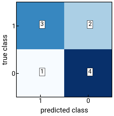
We will again focus on binary classification to illustrate the idea, and actually start with a visualization: the confusion matrix. For a two-class classification problem, the confusion matrix is given by
Positive prediction |
Negative prediction |
|
|---|---|---|
Positive label: |
True positive (TP) |
False negative (FN) |
Negative label: |
False positive (FP) |
True negative (TN) |
where TP, FP, FN, TN are typically counts given in integers. For the confusion matrix, the accuracy of a classifer is generally speaking the most intuitive metric we could calculate, given by:
which is interpreted as “the number of correct classifications out of all data points.”
Scikit-learn performance metrics
Scikit-learn can compute confusion matrices and accuracy (and many other) classification performance metrics using functions in the sklearn.metrics module.
The confusion matrix given a target vector \(\vec{y}\) and predicted classes \(\hat{y}\) can be computed using the function confusion_matrix(y_true, y_pred), which returns a matrix of dimension \(\text{num_classes} \times \text{num_classes}\) with element \((i,j)\) being the number of samples with true label \(i\) and predicted label \(j\).
Note that the order of the two input vectors matters!
Also, if the labels are numerical (e.g., 0, 1), then the output confusion matrix is sorted from smallest to largest, so it might help to explicitly pass a labels=[1, 0] argument to fix the label order for the final confusion matrix [to match what we had above].
The accuracy can be computed by hand from the above confusion matrix, or if we want to directly compute it from the true classes \(\vec{y}\) and predicted classes \(\hat{y}\), we can use the accuracy_score(y_true, y_pred) function.
We again start with an example by hand to get the feel for things.
from sklearn.metrics import confusion_matrix, accuracy_score
y    = [1, 1, 1, 1, 1, 0, 0, 0, 0, 0]
yhat = [1, 1, 1, 0, 0, 1, 0, 0, 0, 0]
classes = [1, 0]
n = len(classes)

cm = confusion_matrix(y, yhat, labels=classes)
acc = accuracy_score(y, yhat)
print(f'The confusion matrix is:\n{cm}')
print(f'The accuracy is: {acc}')

fig, ax = plt.subplots()
ax.imshow(cm, cmap='Blues')
for i in range(n):
    for j in range(n):
        ax.text(j, i, s=cm[i, j], c='black', bbox=dict(fc='white'))
        # note i,j had to be swapped above for labeling text!

ax.set_xticks(np.arange(n))
ax.set_xticklabels(classes)
ax.set_yticks(np.arange(n))
ax.set_yticklabels(classes)
ax.set_xlabel('predicted class')
ax.set_ylabel('true class')
plt.show()
The confusion matrix is:
[[3 2]
 [1 4]]
The accuracy is: 0.7
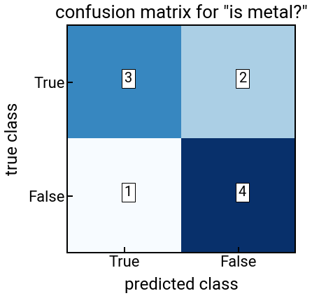
Exercise: compute both performance metrics for logistic regression for the metal classification problem
Hints:
In this problem, you should use
lr.predict(X)to get discrete predicted class labels instead of probabilities.Feel free to change up the features and see if you can increase your accuracy!
from sklearn.linear_model import LogisticRegression
classes = [True, False]
n = len(classes)
df = pd.read_csv('../../assets/data/week_1/04/elem_props.csv')
display(df.head())
# -------------   WRITE YOUR CODE IN THE SPACE BELOW   ---------- #

# --------------------------------------------------------------- #
fig, ax = plt.subplots()
ax.imshow(cm, cmap='Blues')
for i in range(n):
    for j in range(n):
        ax.text(j, i, s=cm[i, j], c='black', bbox=dict(fc='white'))
        # note i,j had to be swapped above for labeling text!

ax.set_xticks(np.arange(n))
ax.set_xticklabels(classes)
ax.set_yticks(np.arange(n))
ax.set_yticklabels(classes)
ax.set_xlabel('predicted class')
ax.set_ylabel('true class')
ax.set_title('confusion matrix for "is metal?"')
plt.show()
| symbol | name | atomic_number | atomic_mass | atomic_radius | row | group | is_metal | electronegativity | density_solid | melting_point | molar_volume | refractive_index | elec_resist | therm_cond | youngs_mod | poissons_ratio | |
|---|---|---|---|---|---|---|---|---|---|---|---|---|---|---|---|---|---|
| 0 | H | Hydrogen | 1 | 1.007940 | 0.25 | 1 | 1 | False | 2.20 | NaN | 14.01 K | 11.42 | 1.000132 (gas; liquid 1.12)(no units) | NaN | 0.1805 | NaN | NaN |
| 1 | He | Helium | 2 | 4.002602 | NaN | 1 | 18 | False | NaN | NaN | 0.95 K | 21.00 | 1.000035 (gas; liquid 1.028)(no units) | NaN | 0.1513 | NaN | NaN |
| 2 | Li | Lithium | 3 | 6.941000 | 1.45 | 2 | 1 | True | 0.98 | 535.0 | 453.69 K | 13.02 | NaN | 9.500000e-08 | 85.0000 | 4.9 | NaN |
| 3 | Be | Beryllium | 4 | 9.012182 | 1.05 | 2 | 2 | True | 1.57 | 1848.0 | 1560.0 K | 4.85 | NaN | 3.800000e-08 | 190.0000 | 287.0 | 0.032 |
| 4 | B | Boron | 5 | 10.811000 | 0.85 | 2 | 13 | False | 2.04 | 2460.0 | 2349.0 K | 4.39 | NaN | 1.000000e+12 | 27.0000 | NaN | NaN |
Caveat: F1 score 🏎 (on your own time)
If we had a little more time, or for those who are interested, we would discuss how accuracy is not the best performance metric for classification. The biggest reason is due to dataset imbalance, which is most often the case with real-world data (materials and otherwise), such as the following: Imagine you do very well (20/20) for positive labels, and pretty well (900/980) for negative labels. In other words, the confusion matrix is:
Positive prediction |
Negative prediction |
|
|---|---|---|
Positive label: |
20 TP |
0 FN |
Negative label: |
80 FP |
900 TN |
What is your accuracy? 92%, which is not bad. But, you might look at this classifier and think, “Uh oh, it’s not picking negative labels that well, which would be a huge problem if those false positives corresponded to a disastrous consequence, like an electric car battery exploding.” 😬
Therefore, we need a different metric(s), and the most common metrics you’ll see in the literature for classification are actually precision, recall, and F1 score.
The precision is the number of True positives out of all positive predictions, given by
It is useful when we want to minimize false positives (since we want to maximize precision).
The recall is the number of True positives out of all actual positives, given by
It is useful when we want to minimize false negatives (since we want to maximize recall).
In most cases, there’s a tradeoff between precision and recall, which is nicely illustrated in this lesson from Google Developers. To balance these two distinct performance criteria, we can compute the F1 score, which is the harmonic mean of the two quantities:
If you want, you can experiment with the appropriate functions in sklearn.metrics to calculate these quantities.
Conclusion
This concludes the exercises on model performance evaluation. In the third leg of this introduction to ML, we’ll take a look at featurization for MI applications, which continues to build on this knowledge. Therefore, please do let us know if you have questions about the material so far.