Best practices for visualizations
Authors: Enze Chen and Mark Asta (University of California, Berkeley)
Note
This is an interactive exercise, so you will want to click the and open the notebook in DataHub (or Colab for non-UCB students).
Learning objectives
This notebook contains a series of exercises that teach best practices in data visualization and give you an opportunity to practice them while exploring some slightly more advanced features in matplotlib. While we’ll try our best to not roast other people 🔥, we do hope you’ll take away from this lesson:
The reasoning behind some of the recommended best practices.
How to implement the best practices in Python.
Import Python modules
The following is a list of Python modules that are useful to import for pretty much any general data science task.
Enze writes these at the top of every Jupyter notebook and Python script.
It can save ImportErrors later on in the notebook.
Now how we’re already familiar with all of them!
import os
import json
import numpy as np
import pandas as pd
import matplotlib.pyplot as plt
%matplotlib inline
Maximum matplotlib customization
In the last notebook, we looked at a few ways we can customize matplotlib plot settings to get a nicer image. But it was pretty cumbersome to have to change it every time (lots of typing) and we can easily forget something. It would be great if there was a way to “set it and forget it,” at least at the beginning of our script, and have the changes saved for future figures.
Turns out there is, through a handy feature known as rcParams.
“rc” is an acronym for “run commands” which refer to startup information on Unix systems, and they govern matplotlib behavior as well.
If we type plt.rcParams into a Jupyter cell and execute it, we will get a massive list of settings structured as a dictionary.
plt.rcParams
It can take a while to sift through this dictionary, but you should be able to pick out a few familiar keys like figure.figsize and font.size.
To change these values in a way that propagates to all matplotlib figures created in that notebook, we can run a cell at the beginning with the following code:
plt.rcParams.update({'figure.figsize':(8, 6)})
where we use a dictionary of the key:value pairs for the custom settings we want, and this dictionary is the argument for the plt.rcParams.update() method.
More on custom styling can be found in the official documentation.
A typical set of “starter settings” that Enze likes to use is:
plt.rcParams.update({'figure.figsize':(8,6),       # Increase figure size
                     'font.size':24,               # Increase font size
                     'mathtext.fontset':'cm',      # Change math font to Computer Modern
                     'mathtext.rm':'serif',        # Documentation recommended follow-up
                     'lines.linewidth':5,          # Thicker plot lines
                     'lines.markersize':12,        # Larger plot points
                     'axes.linewidth':2,           # Thicker axes lines (but not too thick)
                     'xtick.major.size':8,         # Make the x-ticks longer (our plot is larger!)
                     'xtick.major.width':2,        # Make the x-ticks wider
                     'ytick.major.size':8,         # Ditto for y-ticks
                     'ytick.major.width':2})       # Ditto for y-ticks
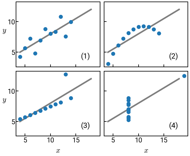
Anscombe’s quartet
Anscombe’s quartet is now a standard lesson on why you should always visualize your data during EDA. Since that work was published almost 50 years ago, there’s been similar efforts to generate all sorts of interesting shapes.
Also note how our plots below no longer look like the wimpy default ones!
from sklearn.linear_model import LinearRegression
df = pd.read_csv('../../assets/data/week_1/03/anscombe.csv',
                 names=['x1', 'y1', 'x2', 'y2', 'x3', 'y3', 'x4', 'y4'])
print(f'The mean of the columns are:\n{df.mean()}')
print(f'The variance of the columns are:\n{df.var()}')

fig, ax = plt.subplots(nrows=2, ncols=2, figsize=(10, 8),    # this is how multiple subplots are made
                       sharex=True, sharey=True)
for i in range(4):
    x = df[f'x{i+1}'].to_numpy()
    y = df[f'y{i+1}'].to_numpy()
    model = LinearRegression()            # curious about this module? Come back tomorrow!
    model.fit(x.reshape(-1, 1), y)
    xx = np.linspace(4, 18, 100)
    yy = model.predict(xx.reshape(-1,1))
    ax[i // 2, i % 2].scatter(x, y)       # whoa, what's happening with the indices here?
    ax[i // 2, i % 2].plot(xx, yy, alpha=0.5, c='k', zorder=-5)
    ax[i // 2, i % 2].text(x=16, y=4, s=f'({i+1})', size=24)

ax[1, 0].set_xlabel('$x$')
ax[1, 1].set_xlabel('$x$')
ax[1, 0].set_ylabel('$y$', rotation=0)
ax[0, 0].set_ylabel('$y$', rotation=0)
fig.subplots_adjust(hspace=0.07, wspace=0.05)   # a stylistic adjustment to maximize plot space
plt.show()
The mean of the columns are:
x1    9.000000
y1    7.500909
x2    9.000000
y2    7.500909
x3    9.000000
y3    7.500000
x4    9.000000
y4    7.500909
dtype: float64
The variance of the columns are:
x1    11.000000
y1     4.127269
x2    11.000000
y2     4.127629
x3    11.000000
y3     4.122620
x4    11.000000
y4     4.123249
dtype: float64
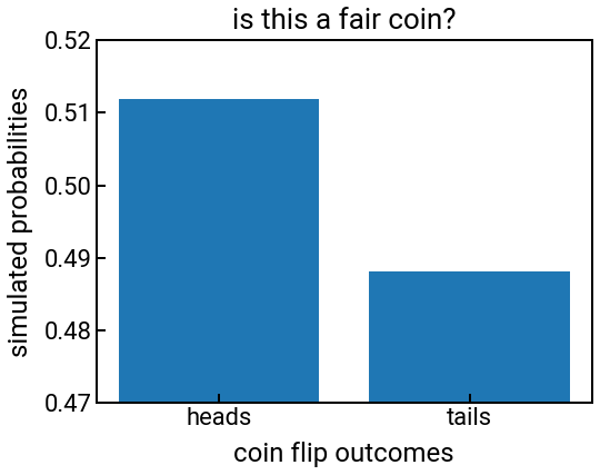
Poorly scaled axes
Exercise: how can we fix the following plot?
outcomes = ['heads', 'tails']
rng = np.random.default_rng(seed=1)
p = rng.random()
probs = [p, 1 - p]

fig, ax = plt.subplots()
ax.bar(outcomes, probs)
ax.set_xlabel('coin flip outcomes')
ax.set_ylabel('simulated probabilities')
ax.set_title('is this a fair coin?')
ax.set_ylim([0.47, 0.52])
plt.show()
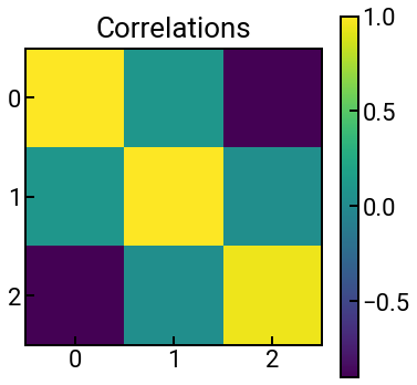
Fun with colormaps
In matplotlib, the gradient of colors that you see on a heatmap or surface plot is determined by the colormap, which matplotlib gives you quite a few options to choose from.
To choose your own colormap, we can add an additional cmap argument to the relevant plotting function (e.g., in ax.imshow()) and set it to be the appropriate keyword from the previous link.
The data below are fictitious, but they’re meant to represent Pearson correlation values.
Exercise: Is viridis (default) the most appropriate colormap?
arr = np.array([[1, 0.1, -0.9], [0.1, 1, 0.04], [-0.9, 0.04, 0.95]])
fig, ax = plt.subplots(figsize=(6,6))
h = ax.imshow(arr)
plt.colorbar(h)
ax.set_xticks(np.arange(len(arr)))
ax.set_yticks(np.arange(len(arr)))
ax.set_title('Correlations')
plt.show()
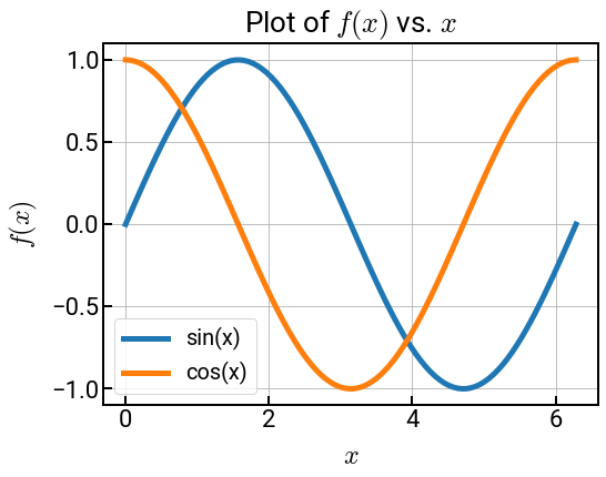
Maximize space for your data!
Exercise: Run the code first. Then uncomment all the commented lines and comment out the legend, title, and grid.
It doesn’t matter too much for this plot, but when materials data starts to get messy, these tips could come in handy. For example, if there are, say, 5 curves, it might be hard to figure out which word in the legend corresponds to which curve (even if they’re color-differentiated), and the legend could start to cover up your lines!
x = np.linspace(0, 2 * np.pi, 100)
y1 = np.sin(x)
y2 = np.cos(x)

# plt.rcParams.update({'xtick.direction':'in', 'ytick.direction':'in'})   # add these two to the big block at the top!
fig, ax = plt.subplots()
ax.plot(x, y1, label='sin(x)')
ax.plot(x, y2, label='cos(x)')
ax.set_xlabel('$x$')
ax.set_ylabel('$f(x)$')
ax.set_title('Plot of $f(x)$ vs. $x$')
ax.grid()
ax.legend()
# ax.text(x=2.8, y=0.1, s='$\sin(x)$', rotation=-64, c='C0')
# ax.text(x=1.2, y=0.1, s='$\cos(x)$', rotation=-64, c='C1')
plt.show()
Conclusion
Woohoo! You’re well on your way towards making flawless research figures! 🎉 We really hope you found this lesson entertaining and instructive. We know it might not seem like there’s any “materials science” or “data science” in this lesson, but having solid visualization skills will take you far in your future career, no matter what you end up doing. It will be extremely important in our future data-centric world! Please don’t hesitate to reach out on Slack if you have questions or concerns about this or any other content.