MSE 104L laboratory 4 exercises
Contents
MSE 104L laboratory 4 exercises
Authors: Enze Chen (University of California, Berkeley)
Note
This is an interactive exercise, so you will want to click the and open the notebook in DataHub (or Colab for non-UCB students).
This notebook contains a series of exercises to help you process your data from Lab 4. It doesn’t answer all of the discussion questions in the lab procedures, but it will help you create some figures that can supplement the narrative of your lab report.
Contents
Fine-tuning your plots

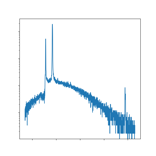
In this lab, you collected a lot of different images/data; however, some of the images aren’t very high quality.
Take the EDS spectra, for instance, an example of which is shown above on the left.
The wall of red is a little aggressive and the fonts are way too small to be read!
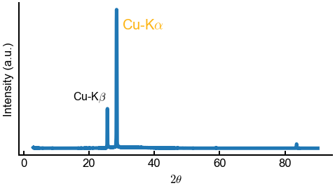
It would be far more effective for you to take the raw data (which hopefully you saved as a TXT file!) and replot it, demonstrated in the above right.
This is a great opportunity to show off your data science and communication skills and remaking figures is commonly done in practice, whether you work in academia, industry, or somewhere else.
Adding annotations
You already know how to make beautiful plots, and now we’ll spice things up by annotating them with text.
The ax.annotate() method is very powerful, capable of adding text, arrows, and many different styles.
We’ll be showing a simple use case, using only the following inputs:
text(str, required): The label you want to add.xy((float, float), required): The coordinates to put the text at (specifically, the lower left corner of the text box). The default coordinate system is specified by the data values.Any optional
Textarguments such asfontsizeorcolor.
Below is an example for an XRD spectra. Obviously, you should make plots for your actual EDS data.
# -------------   WRITE YOUR CODE IN THE SPACE BELOW   ---------- #
import numpy as np
import matplotlib.pyplot as plt

data = np.loadtxt('spectra_demo.txt', delimiter=',')
plt.rcParams.update({'figure.figsize':(8,4), 'font.size':20, 'mathtext.fontset':'cm'})
fig, ax = plt.subplots()
ax.plot(data[:, 0], data[:, 1])
ax.set(xlabel=r'$2\theta$', ylabel='Intensity (a.u.)', yticks=[])

ax.annotate(r'Cu-K$\alpha$', (30, 160000), color='#FDB515')  # Go Bears!
ax.annotate(r'Cu-K$\beta$', (15, 65000), fontsize=16)

plt.show()
fig.savefig('spectra_replot.png', dpi=300, bbox_inches='tight')
Note about LaTeX
You may have noticed that the Greek lettering above is stylized in a different font (also featured elsewhere) and that our Python strings had extra r and $ symbols.
This is the LaTeX typsetting software that is commonly used for professional math text and it comes bundled with Matplotlib.
Neat! 😍
We don’t have time to get into all the possible LaTeX commands right now, but generally speaking most of the commonly used Greek letters in science are available to be used as follows:
The macro is
\letter-namesuch as\alphaor\beta.Enclose the LaTeX in a string, in between
$signs.Analogous to f-strings, it is best practice to add a
rbefore the first quotation mark to escape special characters.Optional, but you can update Matplotlib settings to use
'mathtext.fontset':'cm'for the Computer Modern font, as shown above.
Image processing
So far we’ve been working with text data that you then turn into beautiful figures, but what if the data that you receive is an image to begin with? Images are another data format that will increase the complexities of your data science-driven workflows, so it’s important to be prepared to handle such data from a data management perspective.
It’s also not hard to imagine how a materials characterization tool will give you an image, whether that’s the atomic structure, diffraction pattern, microstructure (grains), elemental map, or something else. And in the age of high-throughput, multi-dimensional experiments, that can easily be a lot of images, coming at you really fast. Therefore, we need to develop techniques for processing images quickly and accurately, and it is our goal in this last exercise to walk you through one such technique. It will involve more data visualization and even a little bit of machine learning (ML). ✨
Image segmentation
When working with images, it is often important to split the image into different parts and identify what’s where. This often occurs in autonomous vehicles (where’s the person?), healthcare (where’s the tumor?), and even materials science (where’s the defect?). You might want to locate the position of a scratch on a surface, identify nuclei growing on a substrate, segment the different grains in your sample, or identify different phases in the microstructure (e.g., MSE 45L steel lab 😜).
This technique of isolating/differentiating parts of an image is called image segmentation, and we will demonstrate a use case using a simplified version of something you’ve seen in this lab. In particular, we’ll take an artificial EDS map and try to isolate where the different elements are to estimate a composition. The reason we call it “artificial” is because Enze generated this 80–20 blue–yellow image using Python so that it’s clean for the purposes of demonstration. Real world data, including the ones you gathered in this lab, are much more messy and require more work. 😁
Working with images in Python
There are several questions we might ask ourselves:
What packages will allow us to work with images in Python?
How is an image represented in code?
How does a computer discern parts of an image?
Answer 1: There are many such packages for working with images, but we’ll use a rather simple one here: the Python Imaging Library (PIL), also known as Pillow.
It imports as PIL and we’ll just be working with the Image module.
Let’s load in an image and display it!
from PIL import Image
img = Image.open('fake_EDS_map.png')
img
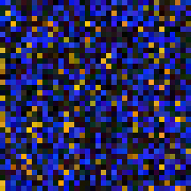
Neat! We see there are some yellow regions, blue regions, and black regions. Our goal is to separate the yellow-ish regions from the blue-ish regions; while this is relatively easy for our eyes to do, a computer cannot “see” color and thus it becomes non-trivial. First, let’s convert this image to a NumPy array to see how these colors are represented in code.
import numpy as np
arr = np.array(img)
print(f'The image array has dimensions: {arr.shape}')
arr
The image array has dimensions: (216, 216, 3)
array([[[  8,  28, 255],
        [  9,  27, 255],
        [  9,  28, 255],
        ...,
        [ 10,  58, 193],
        [  9,  59, 191],
        [  9,  57, 192]],

       [[  9,  28, 255],
        [  7,  28, 255],
        [  7,  27, 255],
        ...,
        [ 10,  59, 193],
        [ 10,  57, 192],
        [  8,  57, 191]],

       [[  7,  29, 255],
        [  7,  28, 255],
        [  7,  29, 255],
        ...,
        [ 10,  58, 191],
        [ 10,  58, 192],
        [ 10,  57, 193]],

       ...,

       [[215, 172,  14],
        [217, 171,  14],
        [215, 171,  15],
        ...,
        [ 33,  23,  15],
        [ 32,  23,  17],
        [ 33,  21,  15]],

       [[216, 173,  15],
        [217, 172,  13],
        [216, 173,  13],
        ...,
        [ 33,  23,  17],
        [ 32,  22,  15],
        [ 32,  23,  16]],

       [[216, 171,  13],
        [217, 173,  15],
        [217, 171,  14],
        ...,
        [ 34,  21,  17],
        [ 32,  21,  16],
        [ 33,  22,  16]]], dtype=uint8)
Answer 2: We see that the image has dimensions of 216 by 216 pixels, and each pixel has three channels, corresponding to red, green, and blue, respectively (RGB).
The amount of each primary color is specified by an integer between 0 and 255 (inclusive), where a larger value indicates more of that color.
At the extremes, we have (0, 0, 0) corresponding to black and (255, 255, 255) corresponding to white.
This is a very standard way of storing images on a computer.
When we view it as an “image,” we’re looking at a combination of the three channels that produces the specific color of each pixel.
Is there another way that we can view this image? If we stare at the array and think about it for a minute, we see that the three channels might also map conveniently onto the three Cartesian coordinates \(x\), \(y\), and \(z\). So rather than combining three channels to make a color, we can use each channel’s value as a coordinate in “RGB-space,” where red maps to \(x\), green maps to \(y\), and blue maps to \(z\). We’ll make a scatter plot of this below and demonstrate some 3D plotting features in Matplotlib.
import matplotlib.pyplot as plt

# convert (N,N,3) 3D array into (N^2, 3) 2D array
rgb = np.reshape(arr, (-1, 3))

# slight modification in figure/axes call
fig = plt.figure(figsize=(7,6))
ax = fig.add_subplot(projection='3d')

# note the new z options
ax.scatter(xs=rgb[:,0], ys=rgb[:,1], zs=rgb[:,2], s=4)
ax.set(xlabel='red', ylabel='green', zlabel='blue')
plt.show()
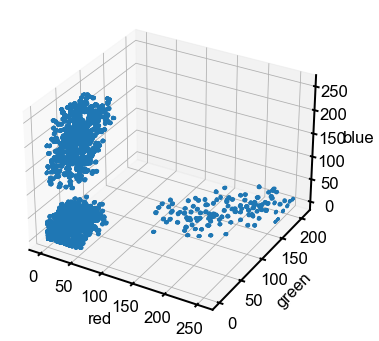
Answer 3: Aha! In this projection of the data, it is a lot more clear how we can separate the pixels. We see three distinct clusters corresponding to yellow, blue, and black, which makes it much easier for an algorithm to isolate out the pixels of a specific color in this 3D RGB space compared to the 2D image. Coordinate transformation is a common trick to help solve mathematical/computational problems. 💡
\(k\)-means clustering algorithm
We will teach a simple, yet powerful clustering algorithm that is commonly used in the ML community for image segmentation (and other tasks). The technique is called \(k\)-means clustering and it works as follows:
Randomly initialize \(k\) cluster centers (let’s call the collection of centers \(C\)).
Loop until convergence:
Assign each point to the closest cluster center \(C_i\), so each point has a label \(i \in \{1, 2, \dots, k\}\).
Recalculate each of the \(C_i\) cluster centers as the mean of the coordinates of all the points with label \(i\).
That’s it! Once the algorithm is done running, you’ll have your final cluster centers and assignment of each point to a cluster. You can then do further calculations, such as extracting only the pixels with a certain label(s) or counting how many pixels belong to each cluster.
While \(k\)-means clustering is a fairly straightforward algorithm to code by hand, we’ll leverage the KMeans module from the Scikit-learn package.
Scikit-learn is an incredibly powerful package with all sorts of ML algorithms implemented in a very modular fashion.
We’ve added detailed comments below for those who want to understand the code more deeply.
# Specific import line for just KMeans from Scikit-learn
from sklearn.cluster import KMeans

# Initialize the object and set a random seed for consistency
n_clus = 3    # what happens if you use more than 3?
kmeans = KMeans(n_clus, random_state=1)

# Calculate clusters based on data and algorithm from above - automated for you!
kmeans.fit(rgb)

# Get the final results
centers = kmeans.cluster_centers_
labels = kmeans.labels_
print(f'Cluster center coordinates:\n{centers}\n')
print(f'Cluster labels: {labels}')

# Replot with labeling colored
fig = plt.figure(figsize=(7,6))
ax = fig.add_subplot(projection='3d')

# separate out each cluster to plot with a different color
for i in range(n_clus):
    idx = labels == i
    ax.scatter(xs=rgb[idx,0], ys=rgb[idx,1], zs=rgb[idx,2], s=4, label=i)

# plot styling
ax.set(xlabel='red', ylabel='green', zlabel='blue')
ax.legend(title='cluster')
plt.show()
Cluster center coordinates:
[[188.21793135 139.09349593  17.29561879]
 [ 24.3132983   22.52407194  24.19338716]
 [ 25.93782879  37.64227642 191.85551836]]

Cluster labels: [2 2 2 ... 1 1 1]
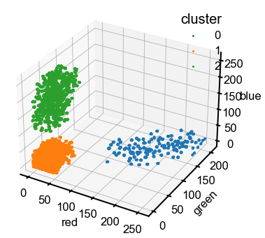
Note: Just the obvious reminder that the color assigned by Matplotlib is not indicative of the actual color of the pixels.
The upper cluster is blue pixels (large values on the blue axis), the right cluster is yellow (large values of red and green), and the lower left is black (small values of all three).
Hey, that looks pretty good! The clustering seems consistent with our expectations, even though it’s not “perfect” as there are a few misassigned points in the upper cluster. Now we’ll do a simple calculation to see if we can get the ratio between labels to get a composition, using the two clusters that are farthest away from the origin. There’s a lot more one can do with manipulating select pixels, using the colors to train an ML classifier, etc.
keys = np.argsort(np.linalg.norm(centers, axis=1))   # order labels based on center's distance from origin
num1 = sum(labels == keys[1])   # num points in one of the non-black clusters; idk which one specifically
num2 = sum(labels == keys[2])   # num points in the other non-black cluster
print(f'Fraction of class {keys[1]}: {num1 / (num1 + num2)}')   # should be close to 0.8 or 0.2! 🤞🏼
Fraction of class 2: 0.8095238095238095
Conclusion
This concludes the programming exercises for Lab 4. We hope you found some of these new ideas interesting. If the combination of computing + characterization is something that you want to learn more about, see the research from Prof. Mary Scott and Prof. Gerd Ceder in this department. 🤖🔬
