Introduction to data visualization in Python
Contents
Introduction to data visualization in Python
Authors: Enze Chen (University of California, Berkeley)
Note
This is an interactive exercise, so you will want to click the and open the notebook in DataHub (or Colab for non-UCB students).
This notebook contains a series of exercises that introduces data visualization using the Matplotlib package to create plots in Python. Why do we care about compelling visualizations? Here are some reasons we can come up with:
Important for scientific communication
Important for data literacy
Reveals more than summary statistics
Uncovers underlying structure
We invite you to think of more! 💡
Intro to Matplotlib
In Python, there are many packages for data visualization, but the base package that many of them are based off of is Matplotlib.
To use the Pyplot module within the Matplotlib package, we write the following import statement and alias to follow the community standard. Be sure to run the cell with Shift+Enter!
import matplotlib.pyplot as plt # standard alias
Create Figure and Axes objects
Step 1: There are many ways to create figures using Pyplot, but the best practice is to create Figure and Axes objects using the plt.subplots() function like so:
fig, ax = plt.subplots()
The Figure object (fig variable) is the top-level container for all plot elements while the Axes (ax variable) is the object for a particular plot.
plt.subplots() creates both of these objects, which we then assign to the variables on the left.
Note it’s possible to have multiple Axes on the same Figure, which helps motivate the need for both objects.
Step 2: To make a plot, we can call a method like ax.plot(x, y) directly using the Axes object—not fig or plt.
This standard method plots \(y\) vs. \(x\) points and, by default, connects the points with lines in the order that they’re plotted.
Note the syntax for ax.plot() is a list (or array) of \(x\)-coordinates and then a list of \(y\)-coordinates, not a list of \((x,y)\) pairs.
Step 3: Finally, and perhaps unintuitively, we have to call plt.show() to actually display the plot.
Just for good measure.
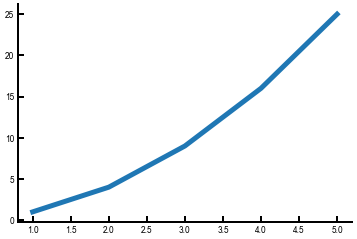
Let’s put this into practice! Here’s a few lines of code to plot \(y = x ^ 2\) for the first five positive integers.
import numpy as np    # standard alias for NumPy as previously discussed
fig, ax = plt.subplots()
arr = np.array([1, 2, 3, 4, 5])
ax.plot(arr, arr**2)
plt.show()
Neat!
We will now show you something slightly cooler by reading in some data using NumPy and plotting the columns of the NumPy array.
This utilizes the np.loadtxt() function and array slicing.
You’ll be doing something similar with your lab data.
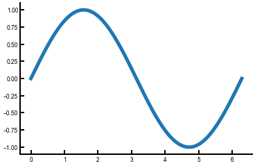
sin = np.loadtxt('sine.txt', delimiter=',')   # we created this file for you
fig, ax = plt.subplots()
ax.plot(sin[:, 0], sin[:, 1])   # first column has x values, second column has y values
plt.show()

Exercise: Write some code to plot the cosine function
The data are already stored in cosine.txt, which is analogous in structure to sine.txt in the above example.
First plot it by itself; then, can you plot sine and cosine on the same plot?
For multiple curves on the same Axes, just call ax.plot() multiple times after creating the axes.
# ------------- WRITE YOUR CODE IN THE SPACE BELOW ---------- #
Saving your plots
To save the figures that you’ve created so you can download them and add them to your lab writeup, we can use the Figure.savefig() method.
This function has a lot of input arguments, so we’ll point out just a few:
fname(str): The name of the file. We suggest adding the file extension explicitly, likemy_picture.png.dpi(int): Short for “dots per inch.” We suggest300as a good standard (default is only100).bbox_inches(str): Some extra padding, and we advisetightfor a streamlined look.
The figure is saved into the same location as your notebook, so this is the corresponding folder in the JupyterHub if you wish to download it (see Usage page for instructions for accessing this page).
sin = np.loadtxt('sine.txt', delimiter=',')
fig, ax = plt.subplots()
ax.plot(sin[:, 0], sin[:, 1])
plt.show()
fig.savefig('sine.png', dpi=300, bbox_inches='tight')
Stylistic improvements
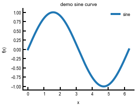
We’re off to a great start, but there are some basic visualization principles that are violated in the above plots, particularly if you had sine and cosine on the same plot. A few things that we can think of right now:
Adding axes labels
Adding a title
Making the font bigger
Making the lines thicker
Changing the figure size
Adding a legend to differentiate plot elements
The code below addresses some of these issues using a combination of:
ax.set()method for axes labels and titles.ax.legend()and thelabelkeyword.Line properties in
ax.plot(), namelylw(linewidth).Figure properties in
plt.subplots(), namelyfigsize(width, height).
sin = np.loadtxt('sine.txt', delimiter=',')
fig, ax = plt.subplots(figsize=(4,3))   # feel free to change!
ax.plot(sin[:, 0], sin[:, 1], lw=4, label='sine')   # pay attention here
ax.set(xlabel='x', ylabel='f(x)', title='demo sine curve')
ax.legend()   # without this the legend doesn't appear!
plt.show()
Exercise: Plot sine and cosine on the same plot and incorporate the stylistic changes
Note that each call to ax.plot() needs a label for it to appear in the legend.
You should find that each call to plot() will automatically change the color of the points that are displayed!
# ------------- WRITE YOUR CODE IN THE SPACE BELOW ---------- #
Making global/persistent changes
We’ll conclude with a protip.
If you did the above exercises, you may have noticed a few repetitive moments.
Perhaps you had to specify the linewidth each time you called ax.plot(), or had to adjust the figure size every time.
It would be nice if we could change the default Pyplot settings so we automatically get some of these improvements every time.
Luckily, we can do that, through plt.rcParams.update(params), which takes in a dictionary of params that we want to modify.
Note that there are a ton of options, so we’ll just list some notable ones here that Enze likes.
Obviously, you can also set your own.
Note also that we have to run this update() command at the beginning of every Jupyter notebook—but then we get the benefits for the rest of the notebook!
plt.rcParams.update({
    'figure.figsize': (5,4),    # (W,H) - XRD spectra could be wider, e.g., (12,5)
    'font.size':         18,    # very important!
    'lines.linewidth':    4,    # good for visuals
    'lines.markersize':  10,    # in case you have scatter plots
    'axes.linewidth':     2,    # the axes should also be more visible!
    'xtick.major.size':   8,    # same for ticks!
    'xtick.major.width':  2,
    'ytick.major.size':   8,
    'ytick.major.width':  2
})
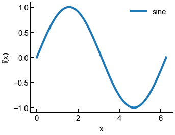
Now let’s make another sine curve and see how these changes are automatically applied.
sin = np.loadtxt('sine.txt', delimiter=',')
fig, ax = plt.subplots()
ax.plot(sin[:, 0], sin[:, 1], label='sine')
ax.set(xlabel='x', ylabel='f(x)')
ax.legend()
plt.show()
fig.savefig('sine_updated.png', dpi=300, bbox_inches='tight')
Conclusion
This concludes the introduction to plotting in Matplotlib. You should have enough tools to get started with analyzing your own Lab 1 data (which you can upload to JupyterHub). The subsequent notebook will guide you through some of the analysis for Lab 1 and discuss further Matplotlib improvements. We hope you enjoy!
